
banner

Thursday, 13 February 2014
Rough digipak analysis

Rough digiapak

Our rough digipak above we did to receive feedback to evaluate what people think of the digipak and what we could improve to make it seem much more professional and related to our music video and website.
Rough music video analysis


This shows some audience feedback we gained for our rough edit. The feedback that we managed to get was relatively positive however the one point which recurrently came up was the fact that the narrative was slightly hard to follow. This was due to the poor editing at the beginning of the video and we plan on focusing on that for our final edit.
Rough edit of final video
This is our rough edit of the music video. There are still many improvement which are going to be tweaked however this version is helpful as it enabled us to gain some rough audience feedback to see what we should improve on the video.
Friday, 7 February 2014
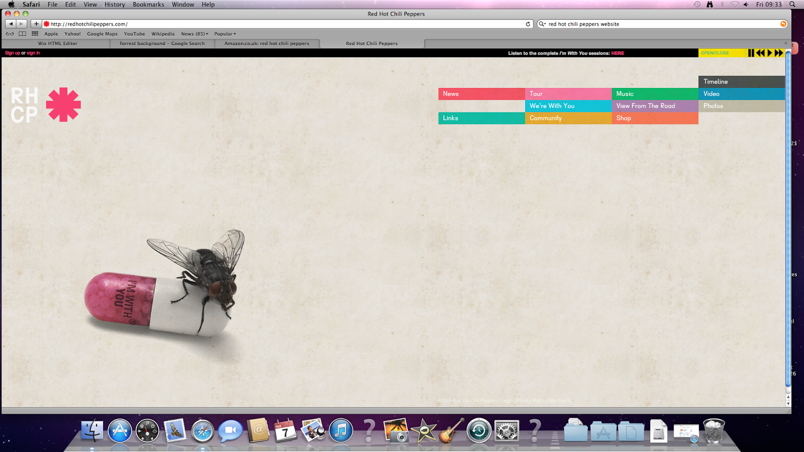
Red Hot Chilli Pepper Album and Website

Wednesday, 5 February 2014
Final record company logo

This is the final logo for the record company logo. It consists of an image of a monitor with the text placed on it 'Bass Records'. The monitor was specifically chosen due to its very generic look within the music industry due to its common use by musicians. The reason also for using a monitor is due to its modern look as it is strongly associated with modern music. We had some ideas previously of using a vinyl record but we decided that it was too generic and outdated and so a modern monitor would suit much better.
Record company logo
Our group member Sulieman created the record label logo, he initially took the pictures in colour using an SLR camera and then edited the photo on photoshop to add the effect and colours it has now.
Subscribe to:
Posts (Atom)