banner
Sunday 16 February 2014
Saturday 15 February 2014

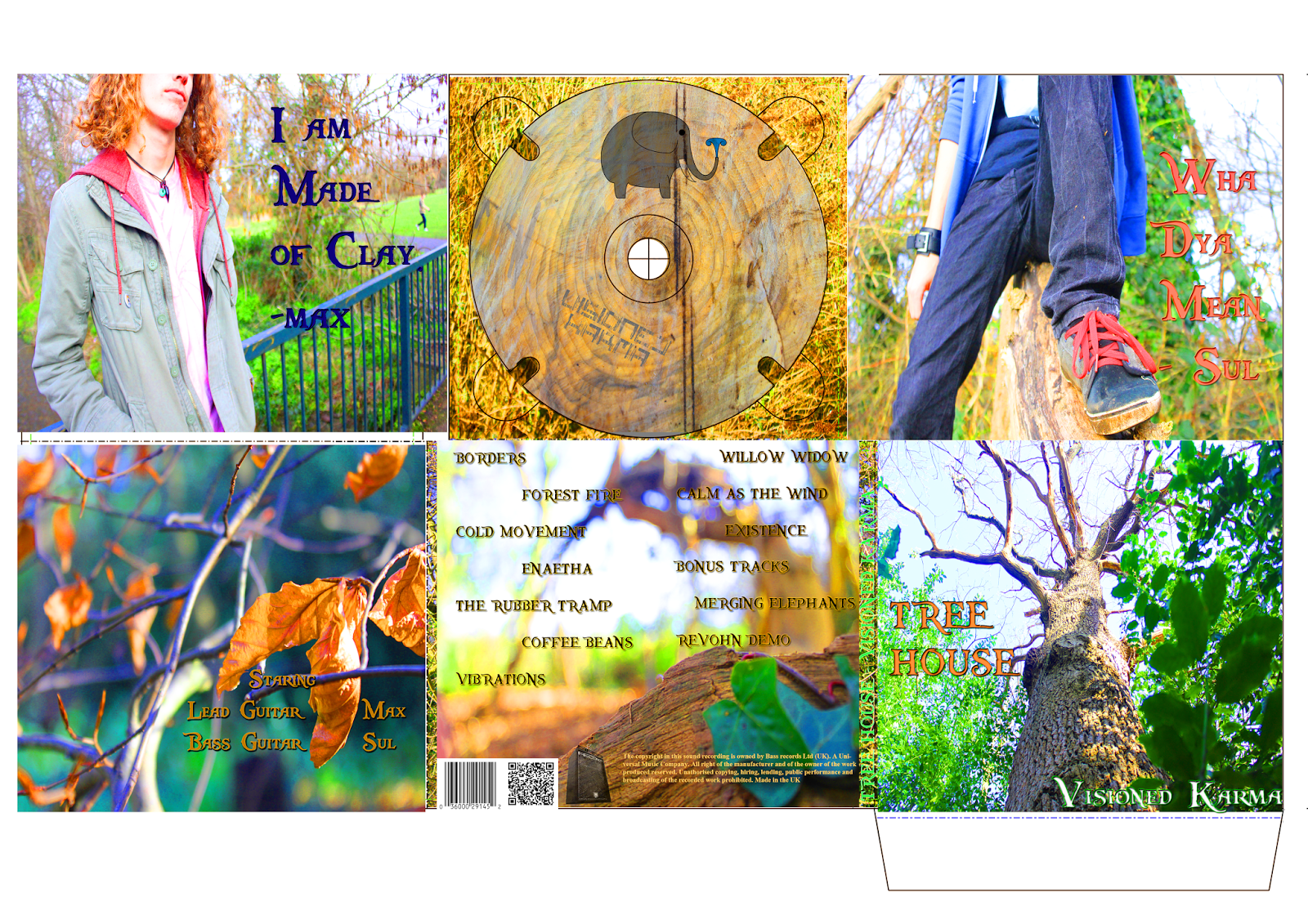
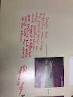
Final digipak
Friday 14 February 2014
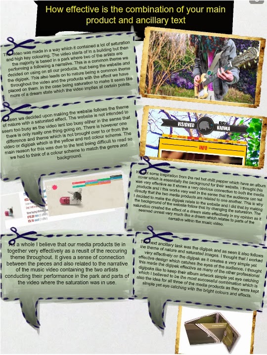
Question 3
What have you learned from your audience feedback?
What they thought of the video?
The first question we asked was whether or not they enjoyed watching the video as the whole concept of a music video is for it to be enjoyable and for people to want to watch it. From the various feedback I have discovered that the people we asked liked the editing of the video and how it was made and put together. Also the use of various camera angles and the throwing of the focus which was a real focus for our group as we wanted to include those kind of shots to help aid the narrative to show a real journey being unfolded and for that to be clear for the audience to see. The people we asked say that they felt there was a real unique feeling coming from the video which was also something we wanted to feature in our video, this was due to the fact that we didn't want a generic rock video however we still wanted some elements to be involved but with the large variety of colouring and techniques we created a unique rock music video which still worked out and happen to be very effective. Also the last person who answered for the first question states that the video put you in a certain place which is something we wanted to accomplish by trying to make the characters relate to some people who are influenced by our choice of genre and this person felt somewhat involved in the video which I believe is a huge achievement as that was one of our main goals in making of the music video.
Could they feel a narrative?
The first person we asked stated that they didn't feel any real narrative while watching the video which was a disappointment as the whole concept of the video was meant to be a journey and for it to be narrative based. However based on feedback from the second person they state to have noticed a narrative but following his explanation it is not the story which we made it out to be, although the fact that it is similar to what he explains give a sense of success in this department for us due to the fact that he didn't miss out that there was meant to be a narrative and that the video wasn't solely performance based. Finally the last person to answer this question mentions that they felt that the video went relatively well in the sense that there is meant to be a narrative. Based on feedback from this particular question I believe that the video was relatively successful in terms of a narrative being recognised by the audience and future improvements would have to be, to make a clearer and possibly a much more simple narrative in order for the audience to be able to understand what is going on in the video and to fully understand the story behind the it and not just an assumption.
What they think worked well?
The first person who answered stated very similarly to the first question how the video was put together in terms of editing and how well it all worked together. I understand from this that the overall editing of the video is very well put together in a professional way to give a sense of a music video, this involves the use of jump cuts at the right moments and also the synchronisation of the music with the video which also worked very well. The second individual explains how they enjoyed the various shot types which were used and how they worked well when combined which is related to the construction of the video, this I believe tells me that the planning, preparation and technical skill when it comes to building our media product worked very well and the previous practice we had has benefited us in the sense that the audience pick up on each technique. As a whole for this question based on the feedback the audience really pick up on what our group wanted to focus on most when editing and filming the music video which gives a sense that we have accomplished something in this sense.
What they liked most?
The first response talks about how they liked the adventurous aspect of the video which I was surprised when I heard due to the fact that it wasn't something we focused on when making the video, although it has worked very well and for the video to gain praise from that aspect implies that there may be other areas or themes in the video which we ourselves didn't intend to use but the audience picked up on and enjoyed. The second reply relates back to how unique the video was and how it didn't fully conform to the regular conventions of a rock music video, this is something we wished to achieve and based on the feedback the audience really picked up on that which infers that our overall production and techniques when making the video worked very well in order to create that effect. Another thing that the same response picks up on is the simplicity involved, this was a common theme we wanted to achieve throughout all the media texts and as a result of it being picked up on indicates that we did really well in that department.
What improvements they would make?
One answer talked about how they felt the need for the ending to be a bit more aggressive due to the music being aggressive as well. Looking back at the video I agree with this statement and is something we should have looked into in a bit more detail because the ending doesn't directly relate to the music in the sense of performance where the two characters are walking while there are loud drops of music still playing over the video which didn't seem the match completely. The second response discusses how the filters didn't appeal to them which I thought wasn't as important as it is dependant on the target audience although they do state that it doesn't match the video completely which is something which may link with the narrative because if the narrative inst very clear then its much harder to realise as to why they're were in place, this links back to issues in how the narrative was put together and represented. The next point they mentioned was that one or two of the shots didn't look to clear, this is agree with and was to do with lighting problems but now I feel that if we do end up having those issues occur again a different location should be taken into consideration or other alternatives to fix the issue. The final person describes the video being very good in the sense that they wouldn't add any significant improvements which makes me believe that we have managed to create a reasonably good video.
Based on all the feedback conducted I believe that our video worked well in the sense that the audience picked up on the majority of things we wanted them to focus on however the biggest issue was the audience finding the narrative difficult to follow. This is an issue which strongly affects our video as we wanted to make the narrative easily noticeable and was the most important part of the video. However positive feedback generally outweighs the negative feedback suggesting the music video was still successful. It has given me future ideas on what mistakes I shouldn't be making in the future and how to overcome them.
Question 1
In what ways does your media product use, develop or challenge forms and conventions of real media products?
The way in which my final media product ended up being presented was over the website youtube. This automatically conforms to modern conventions of music videos with the large portion of them being uploaded to youtube as it is the media source where they are viewed the most. The music video was focused mainly on a narrative perspective following a journey of two artists seeking recognition.
For our music video we decided upon keeping some conventions and also challenging some. Ways in which we conformed was with the use of performance where we had Max and Sulieman performing in sync with the music with their instruments which conforms to the typical convention of performance with the use of instruments within a rock music video. However the way in which we decided to challenge the conventions was with the use of the colours and the scenery. This was particularly evident when the Max and Sulieman were in a park during a bright day which doesn't follow the common themes of rock videos where they are usually performing on a stage with very dark colours with very fast editing and jump cuts. This is where our video was different due to the fact that we didn't follow those themes and decided to make a narrative video which isn't very common.
Open the prezi link
http://prezi.com/s0lzsinggqd1/?utm_campaign=share&utm_medium=copy&rc=ex0share
Thursday 13 February 2014
Rough digipak analysis

Rough digiapak
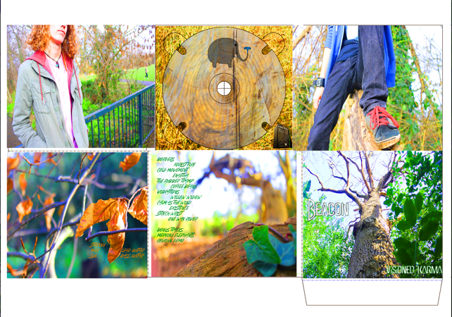
Our rough digipak above we did to receive feedback to evaluate what people think of the digipak and what we could improve to make it seem much more professional and related to our music video and website.
Rough music video analysis


This shows some audience feedback we gained for our rough edit. The feedback that we managed to get was relatively positive however the one point which recurrently came up was the fact that the narrative was slightly hard to follow. This was due to the poor editing at the beginning of the video and we plan on focusing on that for our final edit.
Rough edit of final video
This is our rough edit of the music video. There are still many improvement which are going to be tweaked however this version is helpful as it enabled us to gain some rough audience feedback to see what we should improve on the video.
Friday 7 February 2014
Red Hot Chilli Pepper Album and Website

Wednesday 5 February 2014
Final record company logo

This is the final logo for the record company logo. It consists of an image of a monitor with the text placed on it 'Bass Records'. The monitor was specifically chosen due to its very generic look within the music industry due to its common use by musicians. The reason also for using a monitor is due to its modern look as it is strongly associated with modern music. We had some ideas previously of using a vinyl record but we decided that it was too generic and outdated and so a modern monitor would suit much better.
Record company logo
Our group member Sulieman created the record label logo, he initially took the pictures in colour using an SLR camera and then edited the photo on photoshop to add the effect and colours it has now.
Wednesday 29 January 2014
Final Band Logo
Making of band logo
This was the step by step process of one of group members Sulieman creating the logo for the band, it shows the process of the creating of the logo by choosing the colours and the shapes.
Wednesday 22 January 2014
Analysing digipak in lesson


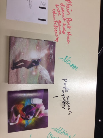
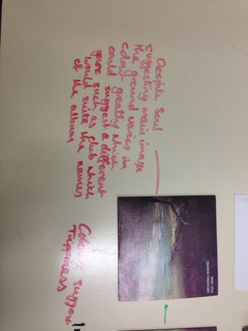
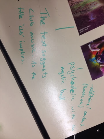
During this lesson we had the opportunity to take a look at a digipak in physical form. We then did some analysis on that digipak writing about the font, images, theme and anything else we could think of in relation to this digipak.
Tuesday 21 January 2014
What is a digipak
What are digipaks?
Digipaks are a type of CD box which are like special editions. They are usually specifically made in order for fans to buy. They are usually a folded piece of cardboard which can be 4 or 6 panels. They sometimes contain additional content such as booklets or postcards. Way in which digipaks benefit the artist is that they are a form of promotion for the artist where fans like to buy special edition items from the favourite artist.
Digipak analysis

Wednesday 15 January 2014
My practice CD cover
Subscribe to:
Posts (Atom)